A little Facebook project of mine recently was to post photos of my favourite LP covers. I am with time on my hands, so every day I ransacked my memory, did some internet research and wrote a spiel for each cover. Little challenges like this keep an old mans brain ticking!
Now I have gathered all my spiels together, starting with ‘Sergeant Pepper. There is no space for all the cover pictures, so I have selected only the first 11. The following paragraphs are what I wrote on Facebook.
I miss my old vinyl LPs. In particular, I miss the artwork on the front of the sleeve. An LP sleeve was, roughly, 31 cms by 31 cms square – room enough for art. Compare this with a CD case – 12 cms by 12 cms. Whatever musical advantages a CD may have over a vinyl disc, there is precious little room for artwork.
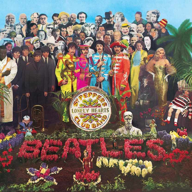
Over the next few weeks Im going to post my favourite LP sleeves in no particular order. Im starting with the greatest one of all time: ‘Sergeant Peppers Lonely Hearts Club Band, released in 1967 by the Beatles. The sleeve, designed by
artist Peter Blake, was a real there was no internet in those days, so identifying all the people in the photo was a impossible task but great fun.
‘Abraxas, released in 1970, was Santanas second album. The album sleeve features a stunning painting – ‘Annunciation - by artist Mati Klarwein. Carlos Santana reportedly noticed the painting in a magazine and asked that it be on the cover of the bands album.
The albums artwork emphasizes the sexual innuendo of the album title, showing a of a male crotch with the visible outline of a penis. The cover of the original vinyl LP features a working zipper.
‘London Calling by The Clash was released in 1979. I have always found the cover artwork very striking.
It features a photograph of bassist Paul Simonon smashing his Fender Bass against the stage at the Palladium in New York City on 20 September 1979. Pennie Smiths photograph was named the best rock and roll photograph of all time by Q magazine, that it captures the ultimate rocknroll moment – total loss of
The artwork, designed by Ray Lowry, pays homage to the design of Elvis Presleys 1956 debut album - with pink letters down the left side and green text across the bottom. The cover was named the ninth best album cover of all time by Q magazine.
Caravanserai is the fourth studio album by Santana, released on October 11, 1972. The cover features a gorgeous blue and yellow photo of a camel train trekking across the desert with a huge orange sun in the background.
In the Near East the word ‘Caravanserai means a group of people and animals travelling together. But Carlos Santana found a different meaning for it when he was reading a text by Indian guru Paramahansa Yogananda: The caravan is the eternal cycle of reincarnation, every soul going into and out of life, from death to life and back again, until you arrive at a place where you can rest and achieve an inner peace. That place is the caravanserai.
‘Dark Side of the Moon by Pink Floyd was released in 1973. A memorable album with a memorably bold and simple cover.
no lettering – just a photograph of a prism, with a colour beam projected through it, against a black background.
‘Disraeli Gears is the second studio album by the British rock band Cream. It was released in November 1967
The cover art was created by Australian artist Martin Sharp who lived in the same building as Clapton.
The front cover consists of a psychedelic collage with the title centred and band name below, surrounded by a floral arrangement. Martin Sharp was attempting to capture the sound of the music in the cover, which he describes as a warm fluorescent sound.
The strange album from a verbal slip by one of Creams roadies. Eric Clapton had been thinking of buying a racing bicycle and was discussing it with Ginger Baker, when a its got them Disraeli Gears, meaning to say derailleur gears, but instead alluding to 19th Century British Prime Minister, Benjamin Disraeli.